
How to Use Google Looker Studio: Step-by-Step Dashboard Guide
The Tuesday Afternoon Data Nightmare
It is 3:15 PM on a Tuesday. Your weekly executive leadership meeting starts in forty-five minutes. You have eight browser tabs open, three separate Google Sheets humming with complex formulas, a PDF export from Google Analytics 4, and an exported CSV from your payment gateway. Your job for the next half hour is to manually copy numbers, reformat currency columns, fix broken #REF! errors, and paste screenshot after screenshot into a slide deck.
Sound familiar? It is the quiet, frustrating routine that thousands of marketers, agency owners, and SaaS operators endure every single week.
Manual reporting is not just annoying—it is risky. One misplaced comma or stale formula can throw off your entire monthly revenue forecast. Worse, by the time you export, clean, and format the data, it is already outdated.
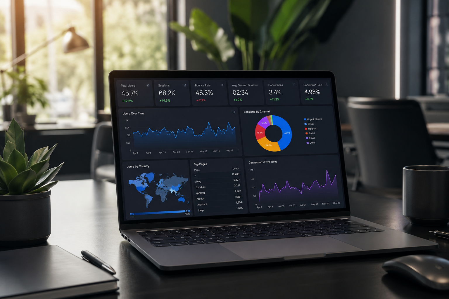
This is where Google Looker Studio (formerly known as Google Data Studio) comes in. It is a completely free, cloud-based business intelligence tool that connects directly to your live data sources. Instead of spending five hours every Monday hacking together static spreadsheets, you build a dynamic dashboard once, set up automated data refreshes, and let the software do the heavy lifting.
In this practical guide, we will walk through building your very first Google Looker Studio dashboard from scratch. No coding experience or advanced statistics degree required.
What Exactly is Google Looker Studio?
At its core, Google Looker Studio is a data visualization and reporting platform. Think of it as a flexible, interactive visual canvas that sits on top of your underlying databases, marketing channels, and spreadsheets.
Rather than forcing you to dig through raw rows and columns, Looker Studio turns numbers into visual cards, trend charts, bar graphs, and heatmaps.
Here is what makes it a core staple for modern software businesses and growth teams:
- Direct Data Connections: It connects natively to Google products like GA4, Google Ads, BigQuery, and Google Sheets, as well as hundreds of third-party platforms via partner connectors.
- Real-Time Data Sync: When your underlying data changes, your dashboard updates automatically. No manual exports required.
- Interactive Controls: Viewers can filter by date ranges, select specific product lines, or isolate user segments on the fly.
- Seamless Collaboration: Sharing a Looker Studio report is as easy as sharing a Google Doc. You can grant view or edit access with standard email permissions.
Whether you are keeping track of customer acquisition cost (CAC) for a growing startup or building monthly client performance reports for an agency, Looker Studio provides enterprise-grade reporting without the five-figure price tag.
Step 1: Navigating the Workspace and Data Connectors
To get started, head over to lookerstudio.google.com and log in with your primary Google account. If you manage client or company data, make sure you sign in with the account that already has administrative permissions for your analytics tools.
Once logged in, you will see the main homepage workspace. It is organized into three main sections:
- Reports: Your saved dashboards and visual canvases.
- Data Sources: Reusable connection pipelines established between Looker Studio and your underlying software stack.
- Explorer: A scratchpad area designed for quick, ad-hoc analysis without altering a published report.
Click the large + Create button in the top-left corner and select Report.
Looker Studio will immediately open a blank canvas and prompt you to add your first Data Source. This is the fundamental building block of any dashboard.
Google Connectors vs. Partner Connectors
Looker Studio organizes its data pipelines into two categories:
- Google Connectors (Free): Built and supported directly by Google. These include Google Analytics 4, Google Ads, Google Sheets, BigQuery, YouTube Analytics, and Search Console. They are fast, reliable, and completely free to use.
- Partner Connectors (Paid/Freemium): Maintained by third-party providers like Supermetrics, Funnel, or Porter Metrics. These allow you to bring in external data from platforms like Facebook Ads, Shopify, Stripe, LinkedIn Ads, and HubSpot.
Pro Tip: If you want to pull data from a platform that lacks a native Google connector without paying for a third-party subscription, export that platform's data into a Google Sheet or database on a scheduled trigger, then use the free Google Sheets connector in Looker Studio.
For our setup today, click on the Google Sheets connector. Browse your account, select a spreadsheet containing sample business data, and hit Add in the bottom-right corner.
Step 2: Understanding Dimensions vs. Metrics
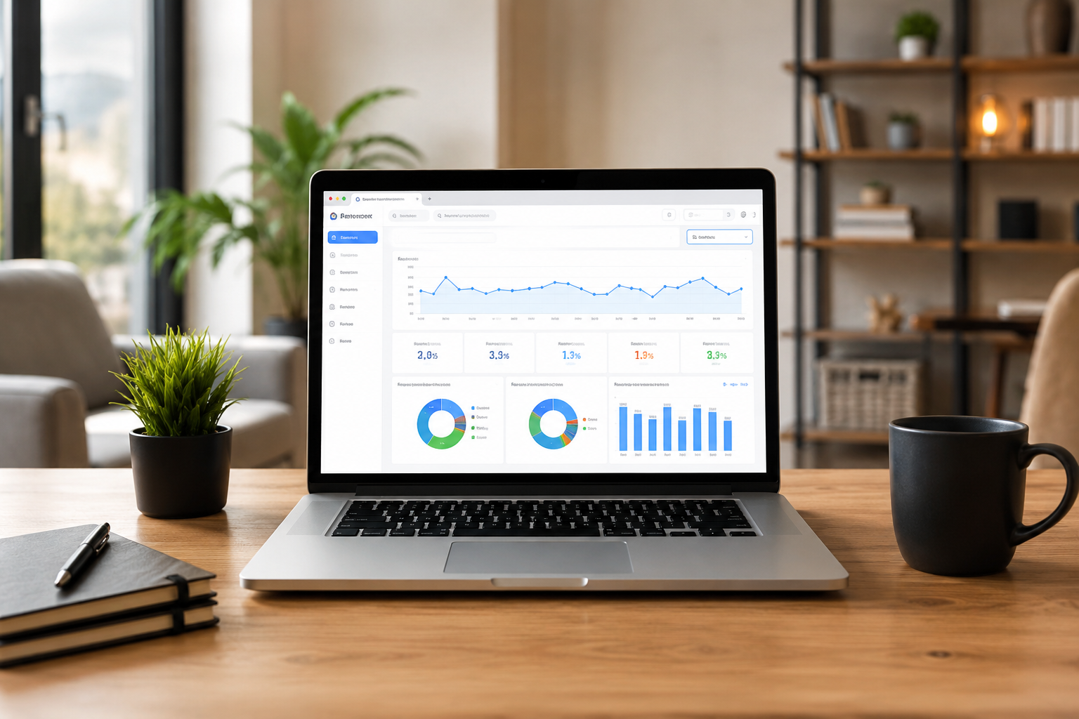
Before adding charts to your report, you must understand how Looker Studio processes and categorizes information. Everything in Looker Studio breaks down into two core concepts: Dimensions and Metrics.
Getting these two mixed up is the single biggest point of confusion for beginners, so let us break them down clearly:
| Category | What It Represents | Examples | Text Color in Looker Studio |
|---|---|---|---|
| Dimension | Quantitative attributes, categories, timeframes, or names that organize data. | Date, Country, Campaign Name, User ID, Device Category | Green |
| Metric | Quantitative measurements, counts, sums, or mathematical calculations applied to dimensions. | Sessions, Revenue, Conversion Rate, Click-Through Rate | Blue |
| Calculated Field | Custom formulas created by combining metrics and dimensions inside the editor. | LTV/CAC ratio, Monthly Recurring Revenue (MRR) per user | Green or Blue |
Think of dimensions as the rows and columns that categorize your data, while metrics are the numbers you aggregate inside those categories.
For example, if you want to know how much revenue your software generated in California last month:
- Dimension: Location (California)
- Metric: Total Revenue ($14,500)
Step 3: Building Core Visualizations
With your data connected and concepts established, your blank canvas is ready. Looker Studio features a top navigation ribbon containing every chart type you need. Click Add a chart to open the menu.
Let us build out a standard business overview dashboard starting with three foundational visual elements.
1. Scorecards (Key Performance Indicators)
Scorecards display a single summary number. They are ideal for high-level KPIs like Total Revenue, Active Users, or Conversion Rate.
- Click Add a chart and select Scorecard.
- Drop it at the top of your report canvas.
- In the right-hand Setup Panel, drag your primary metric (e.g., Revenue) into the Metric field.
- Toggle Comparison Date Range to display percentage growth or decline compared to the previous period.
2. Time Series Graphs (Trend Lines)
Time series charts reveal performance trajectories over days, weeks, or months.
- Select Time Series from the chart dropdown and place it below your scorecards.
- Set your Dimension to Date.
- Set your Metric to Daily Active Users or Order Volume.
- Turn on Show Points under the Style tab to highlight individual data markers along the line.
3. Data Tables with Heatmaps
Tables allow stakeholders to inspect granular numbers without losing sight of overall trends.
- Insert a standard Table with Heatmap.
- Set Traffic Source / Medium as the primary Dimension.
- Add Sessions, Conversions, and Revenue as Metrics.
- The conditional heatmap color intensity will automatically highlight top-performing traffic channels at a glance.
Step 4: Adding Interactive Controls and Date Filters
Static dashboards quickly become obsolete. The real magic of Looker Studio lies in interactive viewer controls, allowing managers and stakeholders to answer their own questions without asking you to edit the report.
To add controls, click Add a control in the top menu bar.
Date Range Controls
This is a mandatory component for almost every business report.
- Select Date range control and place it in the top-right header of your report page.
- In the properties panel, choose a default range (e.g., Last 30 Days, This Quarter, or Year-to-Date).
- When viewers load the report, selecting a new date range dynamically updates every single chart on that page.
Dropdown Filters
Dropdown controls allow users to isolate specific segments of data.
- Select Drop-down list and place it near your date selector.
- Set the Control field to Device Category or Subscription Plan.
- Viewers can now click the dropdown and choose to view metrics for Mobile Only or Enterprise Plan Users.
Pro Tip: To prevent a control filter from affecting certain static elements on a page, select the control alongside the specific charts you want it to affect, right-click, and choose Group. The filter will now only control items within that specific group.
Step 5: Advanced Techniques (Data Blending & Calculated Fields)
Once you master basic tables and scorecards, you can unlock advanced capabilities that make Looker Studio rival expensive enterprise software options.
Creating Custom Calculated Fields
Sometimes your raw source data does not contain the exact metric you need. Calculated fields allow you to write math formulas directly inside Looker Studio.
Suppose your Google Sheet contains Total Revenue and Ad Spend, but you need to display your Return on Ad Spend (ROAS):
- In the right-hand Data panel, click + Add a field.
- Name your field ROAS.
- In the formula box, type: SUM(Total Revenue) / SUM(Ad Spend)
- Change the data type output to Numeric / Percentage and click Save.
Now, you can drop your custom ROAS field into any scorecard or table as a native metric.
Blending Data Across Multiple Sources
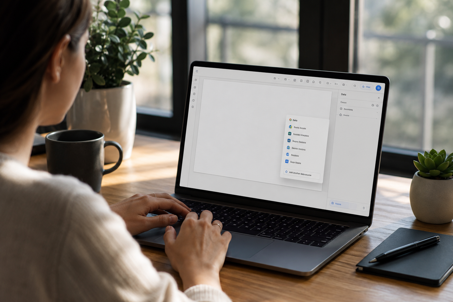
Data Blending allows you to combine datasets from completely separate connectors into a single chart. For example, you can combine web traffic from Google Analytics 4 with cost data from a custom CRM database.
- Select a chart on your page and locate the Data source field in the setup menu.
- Click + Blend Data below the data source section.
- Click Add another data source to connect your second platform.
- Define the Join Condition by choosing a shared field (e.g., Date or Campaign ID).
- Select the specific metrics you want to extract from each source and click Save.
Looker Studio will merge the two sources based on your matching key, creating a unified performance dataset.
Step 6: Styling Your Dashboard for Professional Presentation
Functionality matters, but clean presentation is what makes executives and clients actually use your reports. A cluttered, poorly aligned dashboard creates cognitive friction and hides insights.
Apply these core design rules to turn messy charts into executive-ready dashboards:
1. Establish Visual Hierarchy
Layout your dashboard like a newspaper front page:
- Top Strip: High-level executive summary scorecards (Revenue, Conversion Rate, CAC).
- Middle Section: Macro trend line charts showing performance trajectories over time.
- Bottom Section: Granular breakdown tables, regional breakdowns, and channel analysis.
2. Standardize Your Color Palette
Avoid using random, distracting bright colors across charts.
- Go to the top menu and select Theme and Layout.
- Choose a clean, muted theme (such as Simple Dark or Report Default).
- Use one primary color for overall trend lines (e.g., navy blue) and reserve high-contrast accent colors (e.g., bright orange or green) strictly for highlighting key thresholds or target goals.
3. Utilize Layout Grids and Containers
Use subtle gray background rectangles (Draw > Rectangle) behind grouped components to create clean visual cards. This visually chunks related metrics together, making complex pages easy to read in seconds.
How Saasbonus Simplifies Your Reporting Stack
While Google Looker Studio handles your data visualization, building efficient business operations requires choosing the right software stack from day one. Digging through dozens of SaaS vendors, testing complex integrations, and evaluating pricing tiers can consume dozens of hours.
That is where Saasbonus comes in.
We provide independent, hands-on reviews, practical teardowns, and software discounts to help startups, growth teams, and digital agencies choose the right tools the first time.
Whether you need reliable third-party connectors to feed data into Looker Studio, enterprise-grade analytics software, or streamlined project management tools, Saasbonus helps you evaluate software options with complete clarity.
Step 7: Publishing, Automation, and Sharing
Once your dashboard is designed and configured, it is time to share it with your team, executives, or external clients.
Click the Share button in the top-right corner of the editor interface to access sharing settings:
1. Direct Email and Permissions
Add specific email addresses and assign permissions (Can view or Can edit). This works identically to sharing within Google Drive.
2. Scheduled Email Delivery
Never manually email a PDF report again:
- Click the drop-down menu next to the Share button and select Schedule email delivery.
- Set the recipient list, subject line, and frequency (e.g., Every Monday at 8:00 AM).
- Looker Studio will render your dashboard as an updated PDF and automatically send it to your team every week.
3. Embedding Reports
Select Embed report from the share menu to generate an